A Fun and Colorful Nursery
/——- Updated January 2019 ——-
Last week I shared my new E-Design Business with you. Feels like a dream come true! I showed you how I design a room that is uniquely yours. Today I'd like to share the reveal of my first client project. Let's get started!
Dana and David moved into their new custom-built home when she was in her first trimester of pregnancy. They are both busy professionals, and weren't sure how to pull a nursery altogether. With my E-Design Style Guide I discovered they were looking for a fun space for their new baby to enjoy. Dana wasn't sure of her design style, but knew she would like it to be colorful, and feel warm and cozy. These parents-to-be already have a dog, so a fun animal theme was the obvious choice for them to make. I included several items from their baby registry, and I selected the rest based on their Style Guide answers.
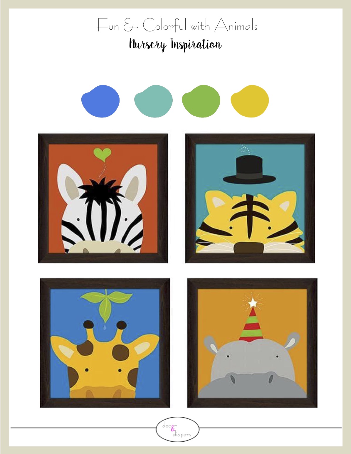
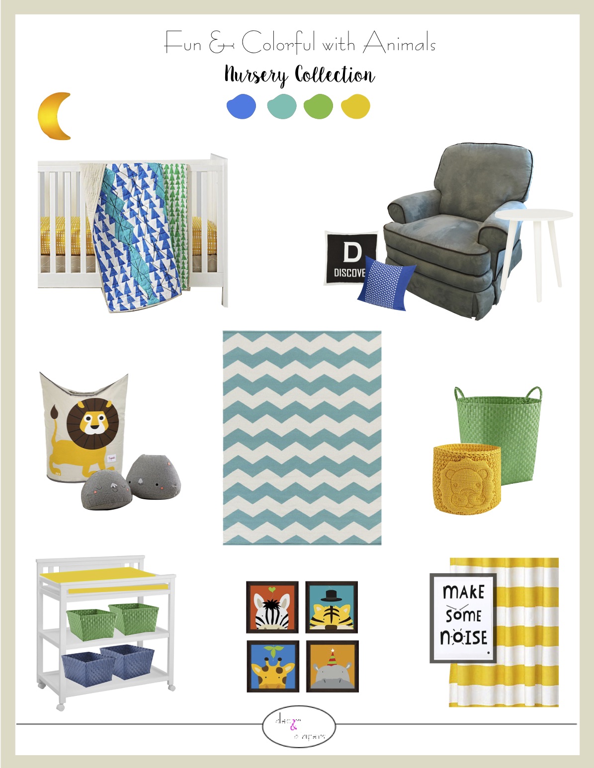
The colorful Peek-a-Boo animal artwork inspired the whole design of this nursery. I found the abstract, geometric bedding at The Land of Nod. I loved the bold colors, and I thought the pattern would complement the animal artwork really well. For a big splash of color on the entrance wall, I chose bright yellow-striped blackout curtains. I hung more animal artwork from the same collection above the changing table to keep the design consistent. Solid color baskets are a great way to add some style to your storage needs. A glowing night light above the changing table works well for night-time diaper changes. Some comfy pillows to rest on or to lay with on the rug, and large toy baskets finish off this nursery design.
I feel that a nursery doesn't need a ton of stuff, because toys, books, play gyms, and the lovely mess that comes with the joy of having children, will all add into the mix.
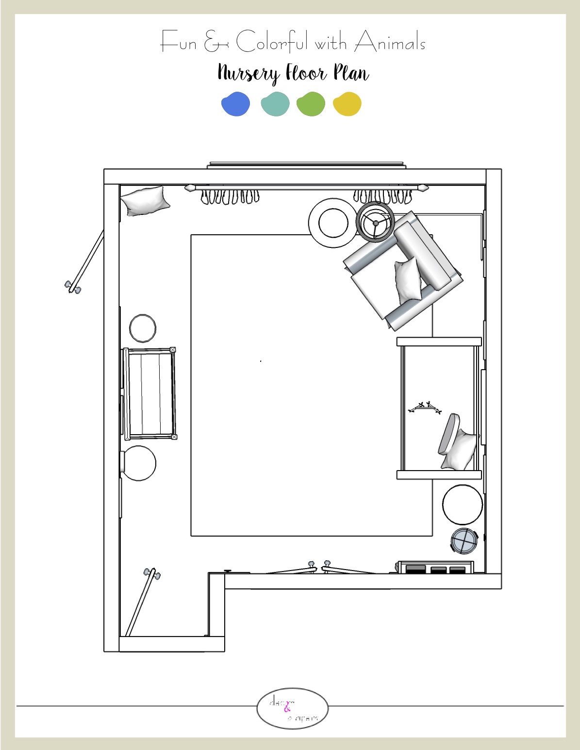
I instantly knew that the crib was going to be on Wall 2 because I prefer not to place it under the window, and it would interfere with the entrance on Wall 4. I placed the changing table opposite the crib to balance the other side of the room. The nursing/reading chair placed itself in the corner. My client also requested a little library corner for her baby, and these book ledges on the wall do not take up any floor space. In a large room it's helpful to lay an area rug to ground the furniture spread around. This 8'x10' zigzag rug really does the trick, plus it's another dose of color in a room with neutral walls and carpet. There is plenty of room for tummy time and playtime in this open floor plan.
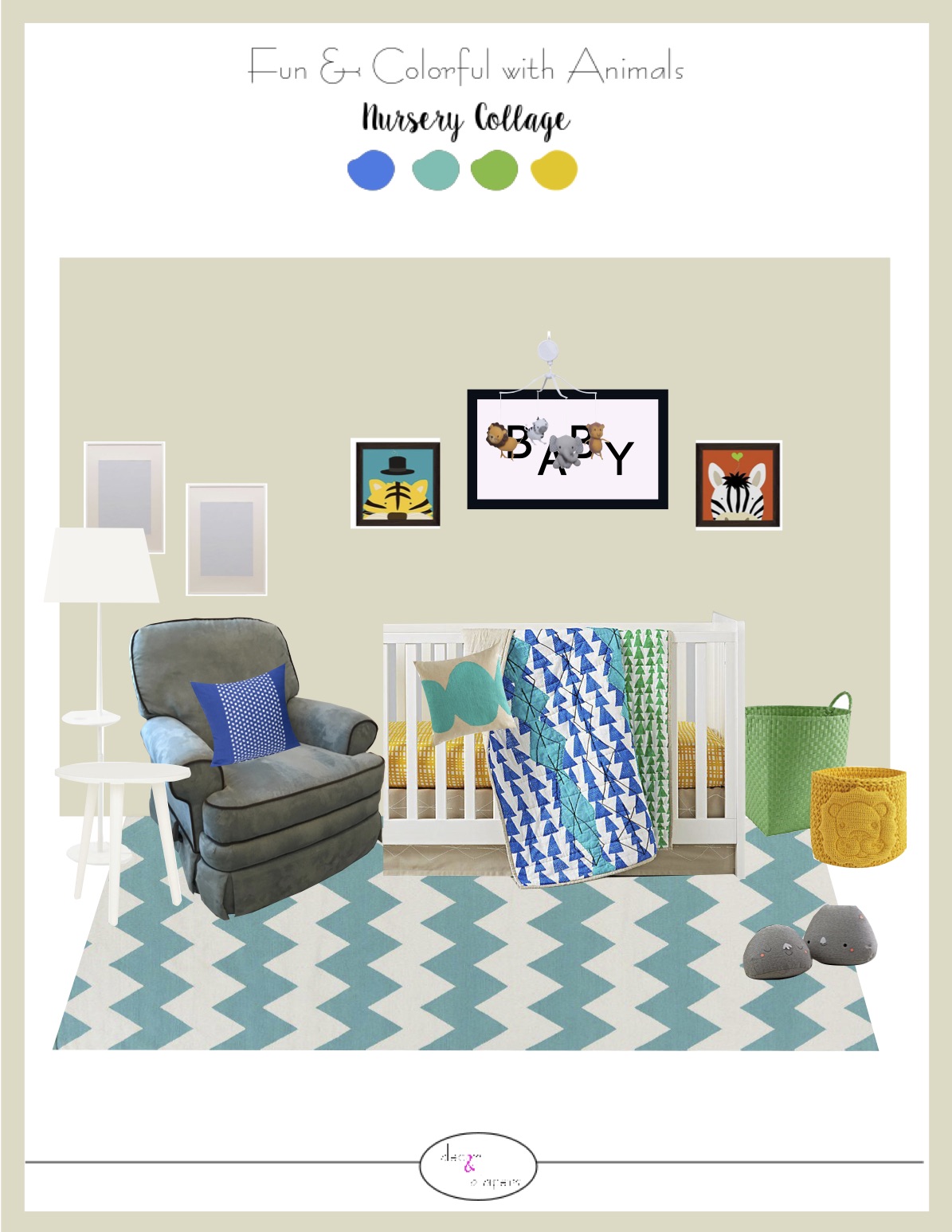
Take a look at this 3D Collage of the crib wall! It definitely feels fun and colorful, don't you agree? Now look below to see how my clients implemented my design plans. They definitely captured the essence of my design, while finding a few alternatives. I'm just so happy they love their nursery!
The Design- After Photo
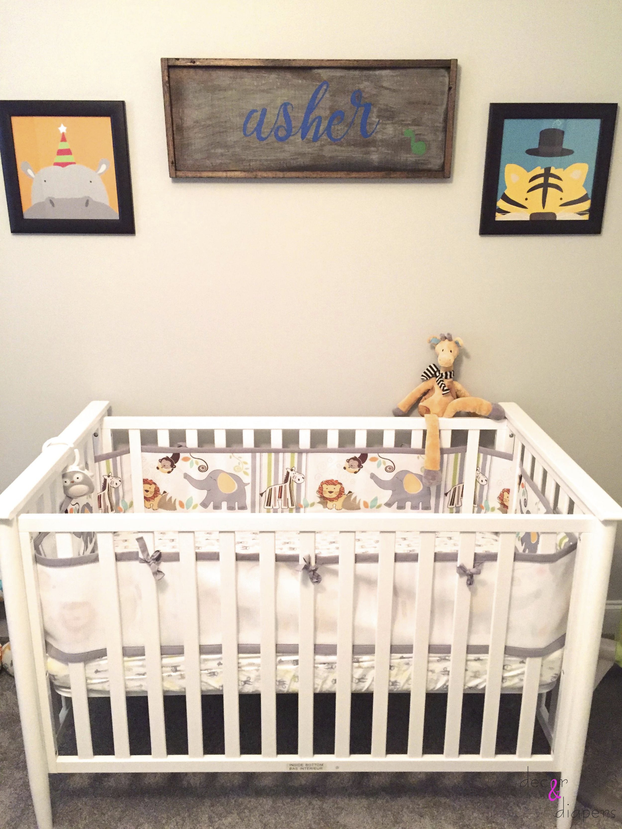
The crib and adorable diy name artwork (made by the clients)
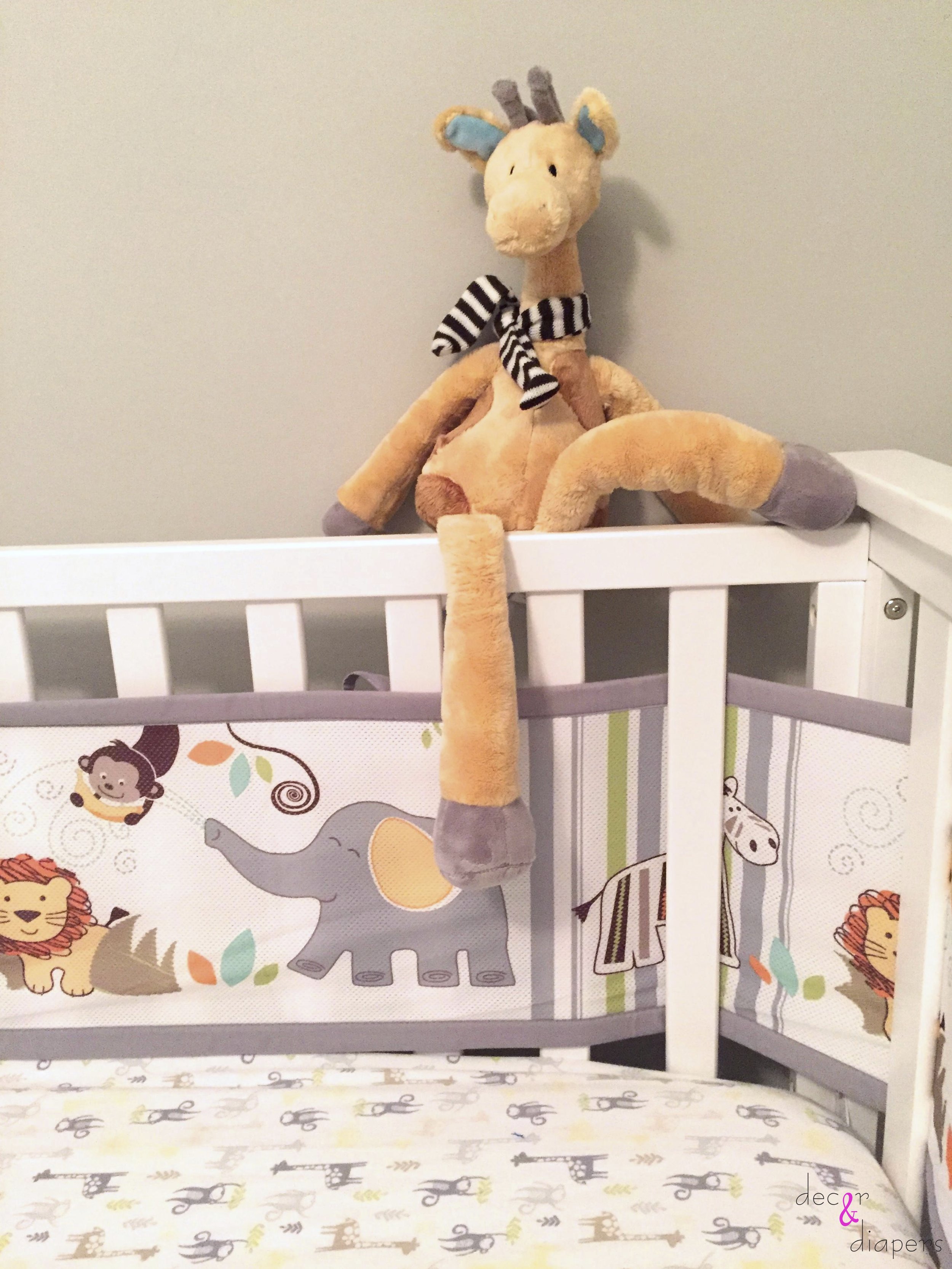
Dana loves giraffes, smile for a close-up :)
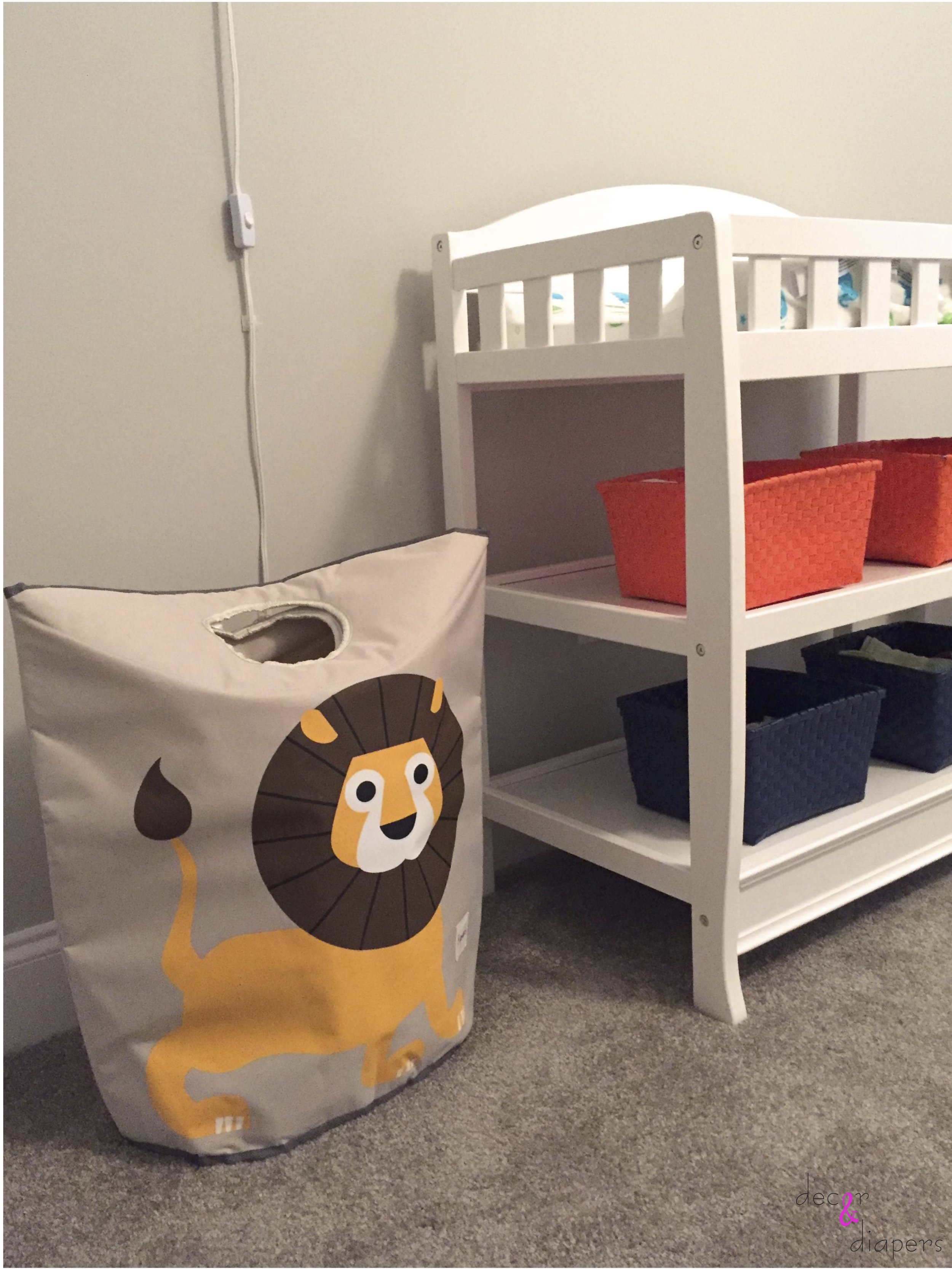
this laundry bag drop-hole converts to a handle when it's time to walk to the laundry room
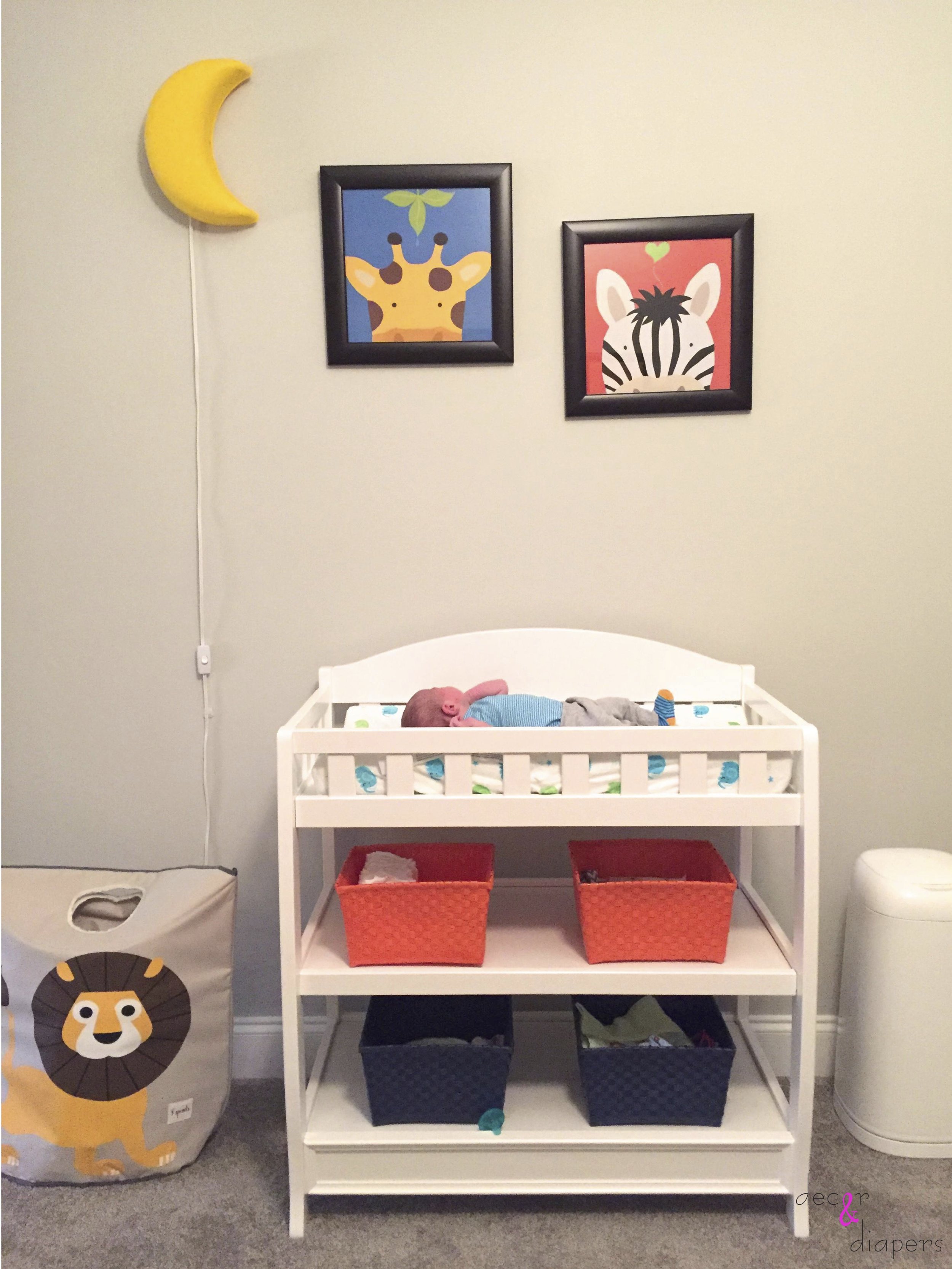
The changing table with colorful bins to hide all your baby essentials, and a glowing moon light above
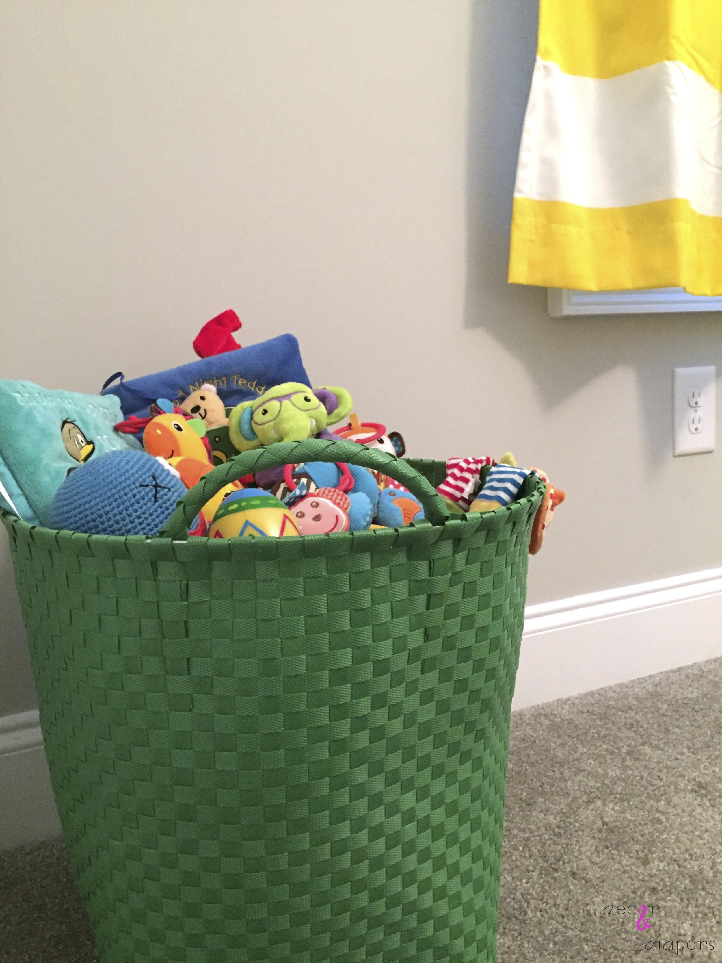
Baby will have easy access to all of his toys at floor level
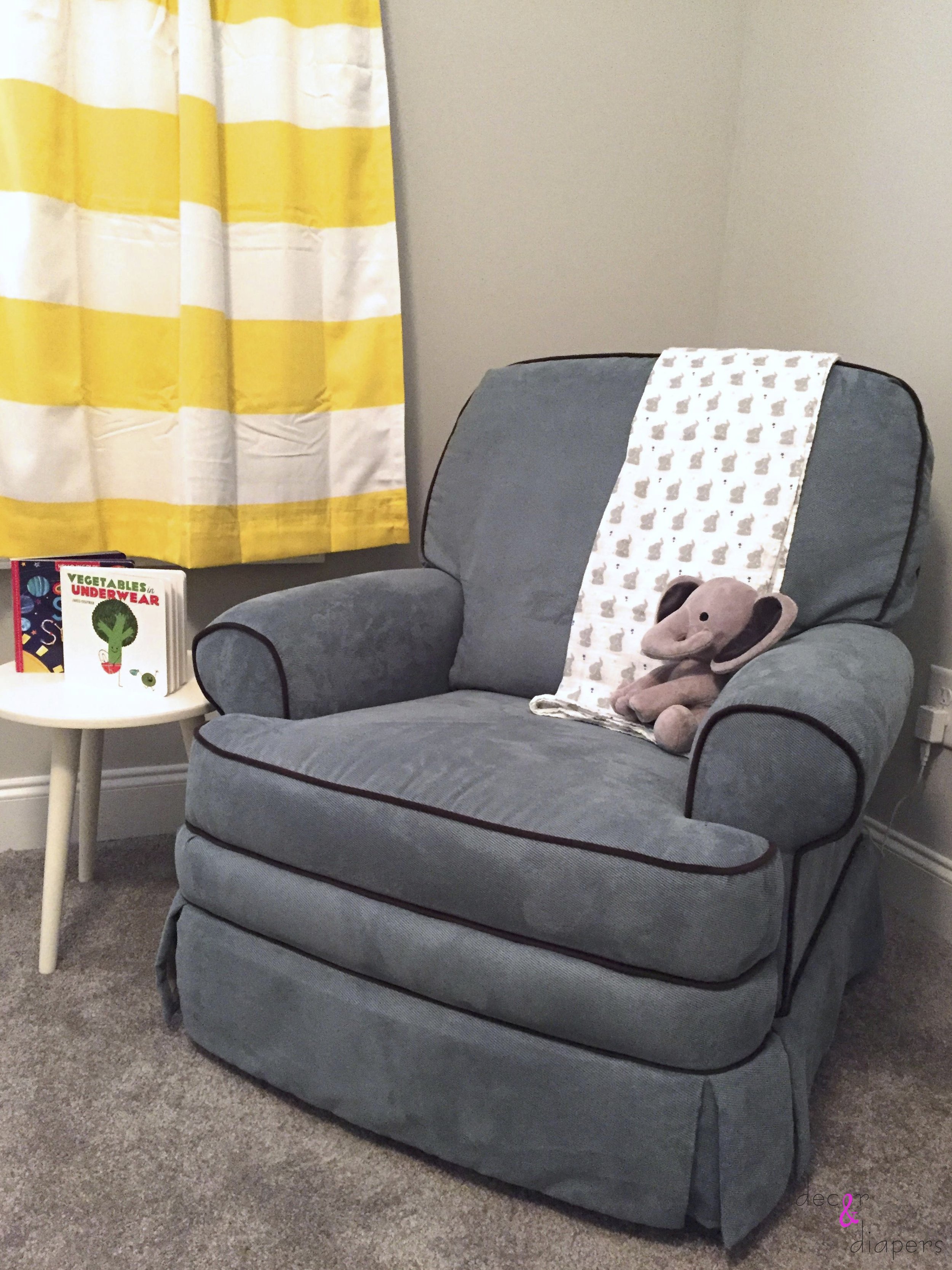
A cozy corner to feed and relax with baby
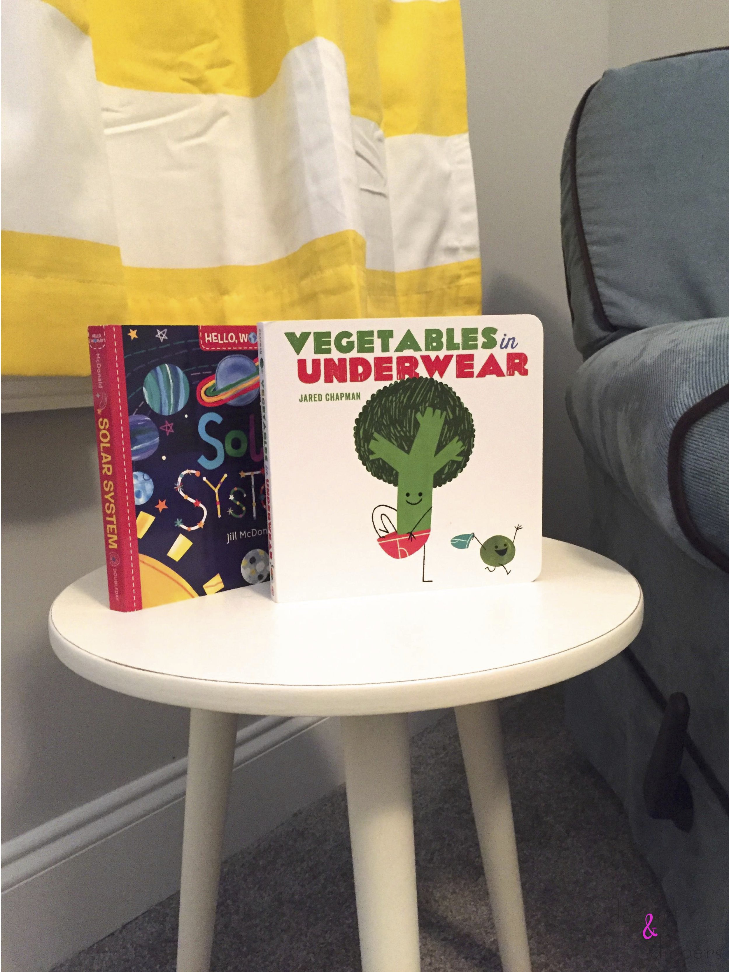
A side table to keep a few books and nursing supplies
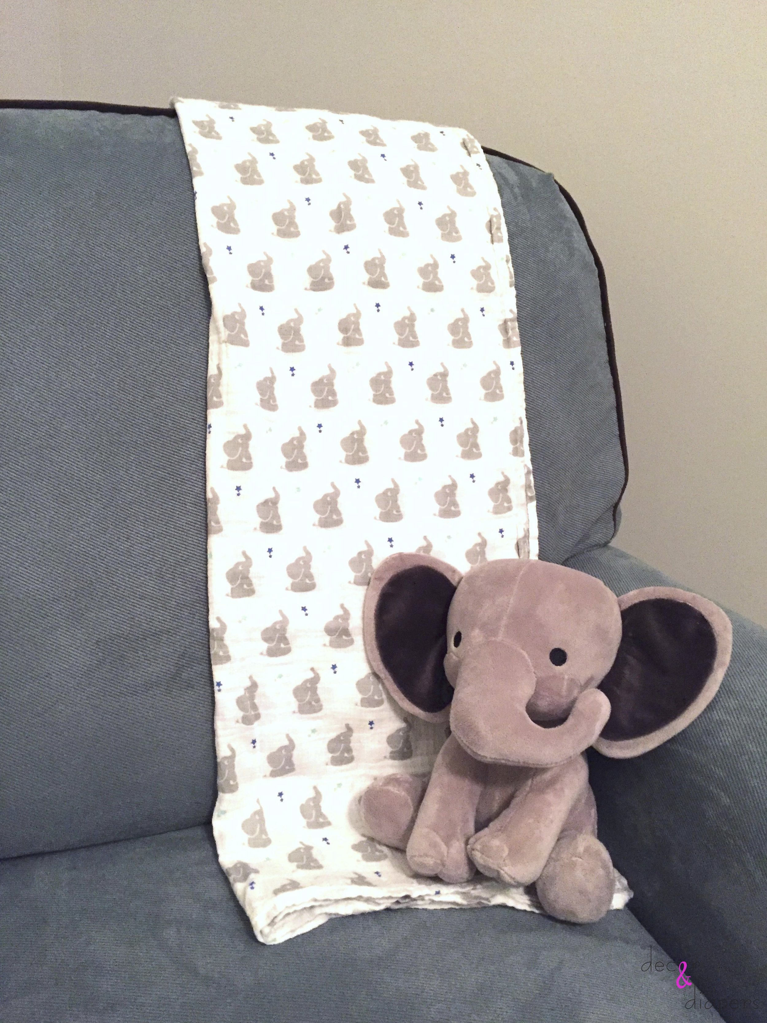
And who can resist a sweet elephant?
David and Dana live across the country from me, but my E-Design Service was the perfect solution to design a room for them. It did not interfere with their busy work schedules or mommy's pregnancy fatigue. Not even the time-change got in our way. Most importantly, I have happy clients. That's what it's all about!
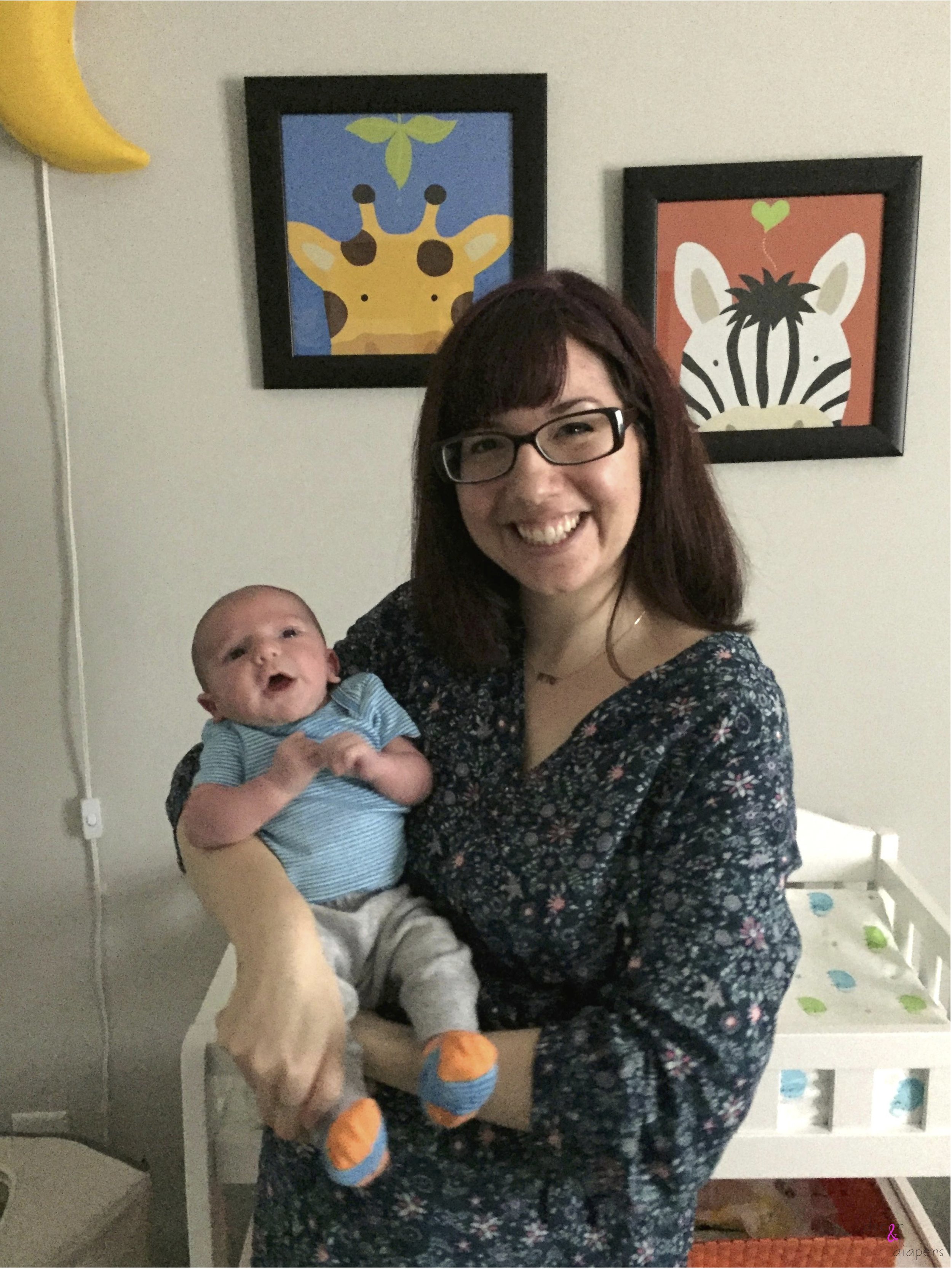
Smiling with my 1 week old nephew!
And for the surprise I mentioned in my last post? Well, I'm more than pleased to share that I am the proud auntie of this baby boy! This nursery design was my baby shower gift to my brother and sister-in-law. I'd do anything for my nephew! "Sweet dreams, Little One..."
