My Living Room Design: Cheerful & Millennial Pink
/You’ve seen a sneak peak of my living room in my blog post A Play Mat That Looks Good in Your Living Room, but now I’ll show you how I came up with the design for my room. It’s a bit backwards from my usual design process, but the principles are the same. Let’s do this!
We signed off on our condo the morning that our baby was released from his 3 week stay in the NICU, and moved in 3 weeks after that. Needless to say, we had our hands full. Luckily, we had a decent amount of furniture for our new home. I worked on a preliminary floor plan, and my husband surprised me one night, and rearranged the whole great room while I was out for a few hours
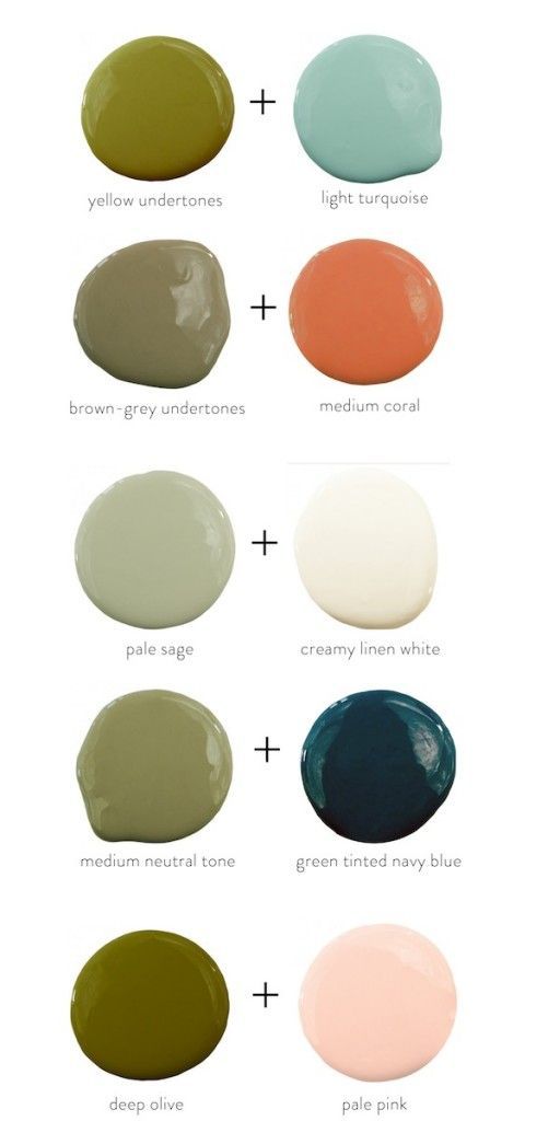
I was drawn to this color palette from elementsofstyleblog.com , that I saw on Pinterest. I started to brainstorm how this could work in my condo. I really wanted to try blush-pink walls, like a neutral pink. My husband’s favorite color is midnight blue, so I thought adding in two shades of blue would balance the pink. I’m not a huge fan of orange in my home, but I remembered that I had an ochre striped throw, that could work as a substitute. And the green? I decided to use that as an architural accent, and painted my hallway an earthy green. Now I just need everything, but the throw- Lol.
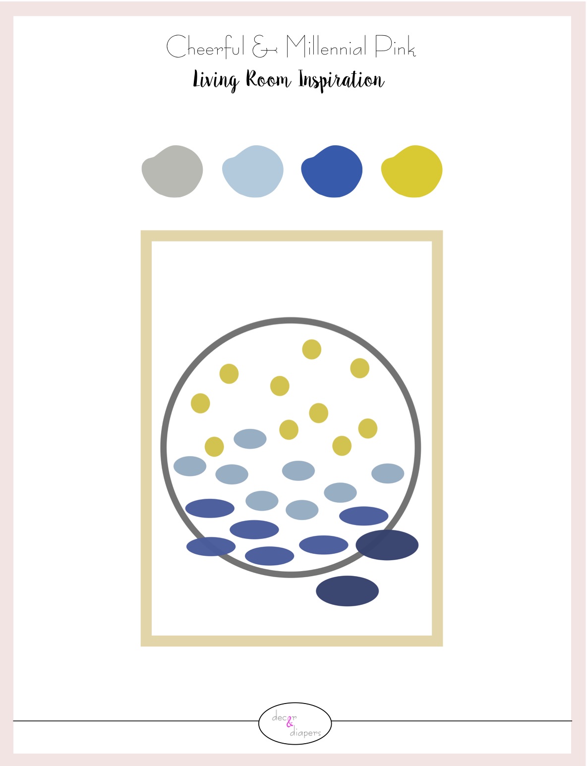
As for the inspiration artwork for my room design, well that was quite a journey. I scoured the internet looking for the perfect piece of artwork. I just wasn’t finding the right piece that both my husband and I fell in love with. Some came really close, but we just couldn’t pull the trigger. I wanted the artwork to be the one element that tied my whole color scheme together. With that in mind, I was able to design the rest of my room.
Several months later, I finally decided to create my own artwork. I designed this in no time, and I got the seal of approval from my husband right away. Thank goodness! I really wanted a circle concept because the feature wall is full of rectangles: the fire place opening, the fireplace surround tiles, the built-ins, the television, the baskets….I just wanted to soften the look of that wall. I also feel like the large grey circle is like a porthole, looking beyond my living room wall. The gradation of color and the evolution of the ovals into the circle are interpretive in so many ways. I think that’s what my husband loves most about. Now, the room was done- FINALLY.
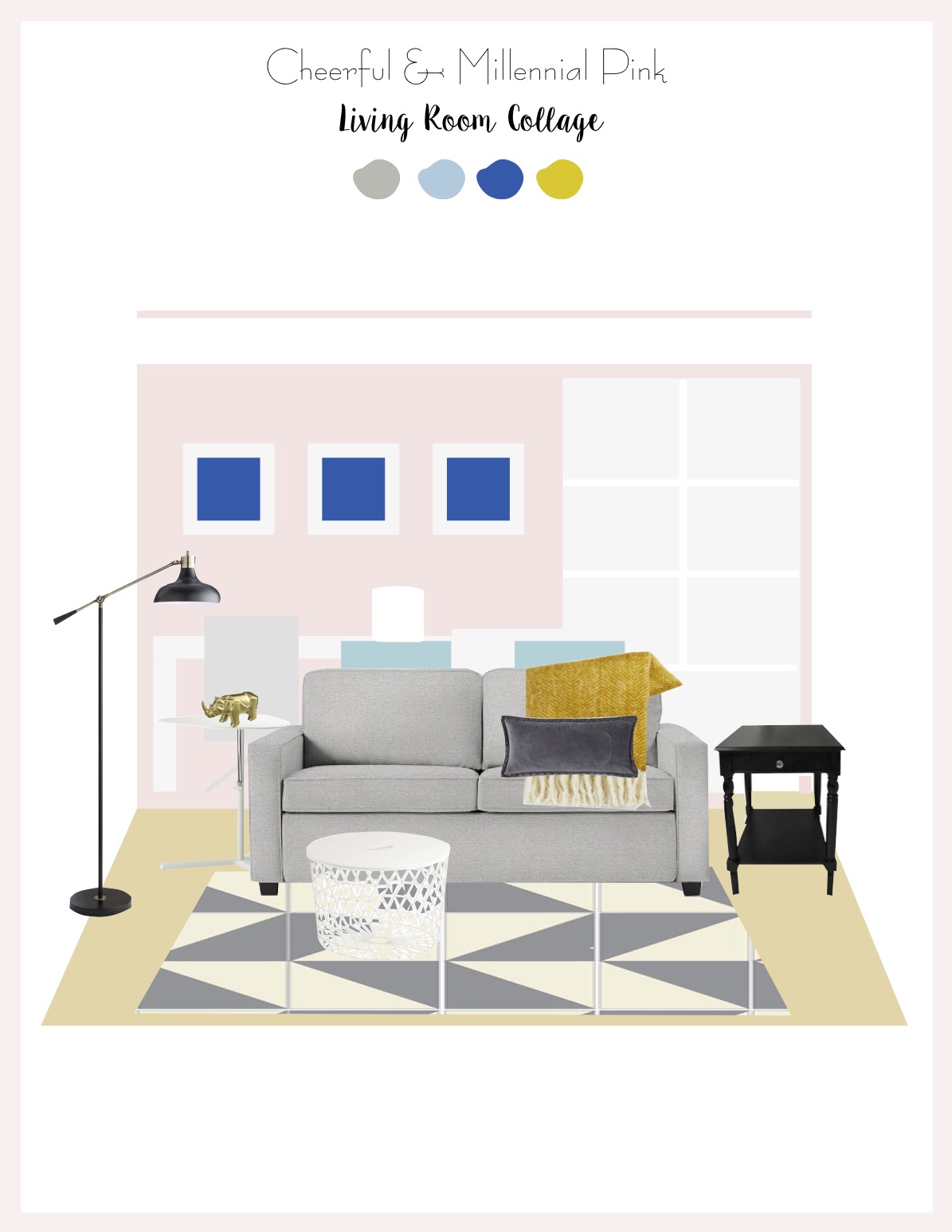
My living room is painted in a very soft and neutral pink, inspired by my watch wristband. I figured since I, as the only female in the home, was outnumbered, I could get away with pink walls (Haha). However, that is the only pink element in the room. (BTW- I was so sucked into motherhood, that I didn’t even realize I had chose a shade of the so-called Millennial Pink) My custom artwork is framed above the fireplace, and I still love it 2 years later! I find the bubble affect so relaxing amidst the chaos of a 3yo and 1yo. My husband put together custom built-in bookcases with a mantle to finish it off. As we accumulated more and more toys, I filled the bookcases with white toy bins- a total must-have item. The artwork rests above the fire place, and is flanked with IKEA lamps. The large felt basket is filled with books that are easy for everyone to reach.
My husband had this beautiful pair of blue, agate bookends that had been in storage for years. This was definitely their time to shine. However, my favorite accessory in the whole room are my jewel cut mirrors. I bought them in the clearance section at west elm, when I worked at the store in Chicago. They add a touch of glamour to the room, and they definitely help bounce light around the room.
The grey storage bench was my first great find at Home Goods. I love that is was a deeper shade of grey and a different material than my sofa. I personally prefer a leather/faux leather accent in a seating area. And it’s been my dream to have a secondary seating spot in my living room. Our new home was just big enough to do so- YAY. I tossed the blue pillow on it for some comfort and color in that area.
I think we have to talk about the play mat/rug first, because it makes a big graphic statement in the room. I chose these triangle floor tiles from Skip Hop because they were stylish and super functional with my baby, at that time. (And they are still wonderful with my toddler and baby 2 year later.) I chose the herringbone pattern, but I can change the look any time I wish.
My other new purchase was the white laptop table. The rounded edges are very kid friendly, and it’s been really functional as a side table. I also got this wire coffee table, another great kid friendly piece of furniture from IKEA. Visually it takes up very little piece with the see through design, there are not sharp corners for kids to run into, and the lid is heavy enough that my babies can’t lift it off.
Above is the revised floor plan, and how it is today.
Grey and whites keep this design feel crisp and neutral. The pops of blue and ochre keep the eye moving around the room, and add some personality. And of course, the soft pink walls just warp the space in a soft hug. And, I didn’t realize it at the time, but this color scheme works so well because it’s a triadic color scheme. These are variations of the 3 primary colors: red, yellow, and blue that are evenly spaced around the color wheel. (Just had to toss out a little color theory!)
I haven’t had the chance to take official After Photos yet, but here is just a little teaser to keep you going!


